ShopDreamUp AI ArtDreamUp
Deviation Actions

Hello again and welcome to issue #2 of Eye for Detail where I will be viewing reviewing and criticizing work. I hope you like what I've picked out for you all this time, I think all pieces here are great to look at and you should definitely take your time to check out some of the artists on here.
Favourite Deviation
It can be tough to choose a favourite of anything when there's so much to choose from that you like. This is no different. It was difficult to choose my favourite piece this issue, but I did decide.
 by
by 
I love this piece that Mac25 has created. It took 2 months and not a single second was wasted here. It's just brilliant. I've seen a lot of hair in my days as a deviant in just 7 months and there are so many that don't look realistic enough. This piece is not the case, the hair looks so realistic, it flows and each single hair is drawn. There's more too. The facial structure looks realistic, the lighting and shadows compliment the piece and those eyes are just great to look at. I highly recommend you look through this deviant's gallery.
Watchers Deviations
Because you watch me, I like to give something back. It's in the form of showing people your hard work. Here are some of my watcher's deviations.

PlasticusForkus Has taken photos of the English riots which began Saturday 6th August, I thought it would be appropriate to share as this is more or less recent news. They did a good job of showing what's happened in London.
:thumb205865094:
cutiefox Has been a watcher of mine for quite some time now, I managed to stumble across their work and liked what I saw. This piece in particular caught my eye and has been a favourite of mine for quite some time now. I hope you enjoy it as much as I do, I love the way they have used lighting here to create little spots of light from in between the leaves. Enjoy! You should also read the character information and the backstory, they're quite good.
:thumb209320478:
ArtofGarethJohnson does a lot of great pieces, this being one of the more surreal ones. I love how he creates them, especially the fact they are black and white images. I imagine his work would make a lot of good tattoos, hey, who knows? Maybe he'll accept a commission for a tattoo. You can always just ask!
Favourite Photograph

Idera13 took this fantastic photograph of fireworks. Taken at a festival, this really attracts the eye immediately. I notice it's just red which is effective for this, one dominant colour. Usually with fireworks there are several colours at a time so it's cool to see just one colour in a fireworks photograph. The first thing that comes to mind when I see this photograph is celebration, as fireworks are often used for. It's a good photograph and I highly recommend you go through this deviant's gallery as it's quite impressive.
Favourite Digital
I love digital artwork, I myself am a digital artist (well, hoping to change that to "good" digital artist at some point) so I can appreciate the effort gone into digital art. Anyway, here is my favourite digital piece this issue:
:thumb235976025:
Self-Epidemic Created this wonderful piece with the wonders of digital art and it's turned out fantastically. Those singed wings and sythe look so unique, I have not seen a piece like this in a long time. The colours blend so well and her vivid red hair stands out as it flows down, the sythe's inscription seems to be glowing, but also giving off the effect of bleeding.
She even wrote a tutorial as to how she managed it: self-epidemic.deviantart.com/a… be sure to see how it was created!
Favourite Traditional
Traditional art has always been something I've appreciated and loved looking at. I envy those who are good with a pencil or brush, I cannot paint or draw on a canvas or paper very well so it's a beauty I can't create. Anyway, here's my favourite traditional this issue:
Felt-heart created this one of a victorian man (interestingly it was initially going to be of a knight). It's peaceful in a way, as death can be. It's sort of sad to look at this piece of a man dead with a sword in hand. Read the description for this deviant's influences and some more information on why this was created.
Favourite Literature
I'm not a big reader myself, but I do enjoy the occasional poem, book or story. Here I'll pick out something that particularly appeals to me.
SketchedExistence Wrote this poem. My interpretation of it is of a woman living in lies, playing out her days as if a nursery rhyme, telling tales of enemies that don't exist. It may not be the intention of this poem but it's how I see it. I also notice at the end she managed to free her hands, maybe escaping the lies and accepting the beauty of truth? Either way you should read this and interpret it yourself.
Colour: Red
Red is a colour used so widely, it's very vivid and is known in humanity as a warning sign. The use of red in art is always interesting to me, for a colour that can be so vivid. It's also highly associated with blood, which is my favourite tone of red. I like the deep crimson tone of red, it looks so rich and powerful to me.

Sarahorsomeone took this one of a feather. I like the vivid red here, it stands right out and catches your eye instantly. The water drops on the feather add to it too, it just adds that little bit more texture to the piece and really works well.
:thumb244818875:
Reicon Has created this digital wonder. It takes a while for you to really absorb the surroundings of the piece which makes it so much more interesting. I love the fireballs hurdling towards the ground and the trees are burning in the background too. The focal though is magnificent. I love the small amount of blue used here to make it stand out more. You should click the thumbnail and read the description too, it's a good read.
Theme: Music
Music is a very general theme. There are so many genres of music now I couldn't count if I wanted to. Music is about three things; talent, interpretation and harmony. You need talent to play good music, you need interpretation to understand meaningful lyrics and melodies and you need harmony for the music to work together with other instruments and vocals. Without all three you just have noise. Anyway, here are some good pieces to do with music.

aque-mizuhara created this piece of an angel singing. They have used harmonic colours here that really add to the piece. The music notes coming from his mouth is a little cliché, but I think it works well with the image, especially how it just flows out as does music. If only we could hear his voice.

palemoonwolf created this one of a dancer. It's a good water colour and the techniques used here can be improved a little but it's a great piece to look at. The background reminds me of the big red curtains in huge theaters where dancers and musicians alike perform. It does give me a great picture in my head, particularly "Las Vegas" comes to mind when I see this piece.
Upcoming Talented Work
True-Or-False - This deviant has submitted a few to be featured in this issue, but none have fit the categories well enough for a thumbnail. I do appreciate this deviants work though, they have some nice photos and traditional work. You can tell they are improving upon themselves as you look through their gallery from first deviation to last.
cannibalchicken - Someone to watch if you like animals in general. This devaint creates great work centered around animals and you should definitely check them out some time. A piece I like in particular is of a dragonfly-man: cannibalchicken.deviantart.com…
Criticism
This is where I'll be criticising deviations. I will only do this with your permission, of course. If you want criticism (constructive criticism I should point out) just tell me next issue which piece you want criticised and if I can write enough about it, I will publish it here.
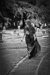
This is The Widow in the Wind by imapenguinridingyosh. First of all what I like about this. I like the fact this is a black and white photo, it wouldn't work well any other way. The green of the grass, colours in the gravestones and dress would all look wrong for this. First of all, I notice she's holding the dress instead of letting it hang, which somehow puts me off. Now I see a graveyard here, I imagine the subject looking more lost. She's a widow, her partner died and she is upset to say the very least. I notice that she's heading away from the set path here, which adds to the whole "lost" effect I'm trying to see here. Something else I'd like to point out is this girl would look a lot better if she somehow looked ghostly as if she was the departed herself.
It's a nice peice and I give it a 7/10, it can be improved but it's on the upper end of the scale here.
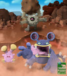
TheMoonMonkey has created this digital piece. I know it's a pokemon drawing, I can tell because of the pokemon in the back throwing the boulder. Anyway, I think this is a decent piece. The first thing I notice to criticise is the pokemon hiding near the rocks in the back. It took me a while to notice it, I think it would be better if it was more involved in the picture itself (but still in the background). There's a good use of shadows here and I like the fact the pokemon at the front seem distressed at what's happening. If I were to improve this piece I would move the Diglett pokemon a bit farther forward to give it more attention, but not too much. I would also add some more texture to the rocky terrain, as rocks are rigid, hence needing more detail.
In total thie piece gets a 7/10 from me as well. The emotion here is effective but the piece can be improved too, it is a good piece but can become a great piece with a few more additions.
Shameless Self Promotion
Just me here promoting my own work. It's only 1 thumbnail and a short description because the newsletter's not about my own work really, it's about others'.
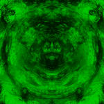
I made this. It looks like there are dragons here in the abstract which is why I submitted it instead of all the other abstracts I tried to make, I like how it turned out.
Other
For information on how to be featured in the next issue, contact me or read my journal: "Features: How to get featured" for details on it.
Also I will be needing some help soon. If you are willing to help me out with submitting this newsletter or just want to point out any deviation that you think is worth a mention in my next issue, just note me, post a comment on my profile or any other way to get into contact and I will consider it. I always ask for the permission of the deviant before submitting their work to this newsletter.
Well that's it for this issue, thanks for taking your time to read it, I hope you have enjoyed reading this and viewing other's work as I have enjoyed writing it. It took about a month for me to complete this unfortunately, so it's very late from schedule (I was meant to release it weeks ago) but I will be making another issue and I will try to make sure I manage to submit it within a week or two. Thanks again for reading and click "love it" if you enjoyed it! The more people who love it the more inclined I'll be to write it again.
Previous Issue: fav.me/n156391
Favourite Deviation
It can be tough to choose a favourite of anything when there's so much to choose from that you like. This is no different. It was difficult to choose my favourite piece this issue, but I did decide.
by I love this piece that Mac25 has created. It took 2 months and not a single second was wasted here. It's just brilliant. I've seen a lot of hair in my days as a deviant in just 7 months and there are so many that don't look realistic enough. This piece is not the case, the hair looks so realistic, it flows and each single hair is drawn. There's more too. The facial structure looks realistic, the lighting and shadows compliment the piece and those eyes are just great to look at. I highly recommend you look through this deviant's gallery.
Watchers Deviations
Because you watch me, I like to give something back. It's in the form of showing people your hard work. Here are some of my watcher's deviations.
PlasticusForkus Has taken photos of the English riots which began Saturday 6th August, I thought it would be appropriate to share as this is more or less recent news. They did a good job of showing what's happened in London.
:thumb205865094:
cutiefox Has been a watcher of mine for quite some time now, I managed to stumble across their work and liked what I saw. This piece in particular caught my eye and has been a favourite of mine for quite some time now. I hope you enjoy it as much as I do, I love the way they have used lighting here to create little spots of light from in between the leaves. Enjoy! You should also read the character information and the backstory, they're quite good.
:thumb209320478:
ArtofGarethJohnson does a lot of great pieces, this being one of the more surreal ones. I love how he creates them, especially the fact they are black and white images. I imagine his work would make a lot of good tattoos, hey, who knows? Maybe he'll accept a commission for a tattoo. You can always just ask!
Favourite Photograph
Idera13 took this fantastic photograph of fireworks. Taken at a festival, this really attracts the eye immediately. I notice it's just red which is effective for this, one dominant colour. Usually with fireworks there are several colours at a time so it's cool to see just one colour in a fireworks photograph. The first thing that comes to mind when I see this photograph is celebration, as fireworks are often used for. It's a good photograph and I highly recommend you go through this deviant's gallery as it's quite impressive.
Favourite Digital
I love digital artwork, I myself am a digital artist (well, hoping to change that to "good" digital artist at some point) so I can appreciate the effort gone into digital art. Anyway, here is my favourite digital piece this issue:
:thumb235976025:
Self-Epidemic Created this wonderful piece with the wonders of digital art and it's turned out fantastically. Those singed wings and sythe look so unique, I have not seen a piece like this in a long time. The colours blend so well and her vivid red hair stands out as it flows down, the sythe's inscription seems to be glowing, but also giving off the effect of bleeding.
She even wrote a tutorial as to how she managed it: self-epidemic.deviantart.com/a… be sure to see how it was created!
Favourite Traditional
Traditional art has always been something I've appreciated and loved looking at. I envy those who are good with a pencil or brush, I cannot paint or draw on a canvas or paper very well so it's a beauty I can't create. Anyway, here's my favourite traditional this issue:
Felt-heart created this one of a victorian man (interestingly it was initially going to be of a knight). It's peaceful in a way, as death can be. It's sort of sad to look at this piece of a man dead with a sword in hand. Read the description for this deviant's influences and some more information on why this was created.
Favourite Literature
I'm not a big reader myself, but I do enjoy the occasional poem, book or story. Here I'll pick out something that particularly appeals to me.
To PerceiveShe pulled at the ties, murmuring logic in sickly sweet tones.
She breathed in yesterday and let it go-
Released it so it would burst in the Sun.
She pulled apart the threads-
The connections of skin and nerve endings until
She saw the world in a new and different way.
She hid behind the mirror,
Asking her reflection to play sentinel
As she learned to crawl past old, dead ends.
She released the marrow from its bones
And woke up the music in songbirds' throats.
She whispered dreamscapes into wide-open minds and
Tried to breathe back in the dawn.
She's tired and worn; somehow still moves on.
She sings about bags of wool as she
Replays old nursery rhymes against her teeth and palate.
She snips fragments of red cloth and paints them
Into a cohesive picture…
But there's no big bad wolf to gobble her whole.
(Just her own actions and lack of control.)
She pulls at the ties,
And manages to free her hands…
And her hands are wings and dreams and
The chance to wake up and sing.
She says
SketchedExistence Wrote this poem. My interpretation of it is of a woman living in lies, playing out her days as if a nursery rhyme, telling tales of enemies that don't exist. It may not be the intention of this poem but it's how I see it. I also notice at the end she managed to free her hands, maybe escaping the lies and accepting the beauty of truth? Either way you should read this and interpret it yourself.
Colour: Red
Red is a colour used so widely, it's very vivid and is known in humanity as a warning sign. The use of red in art is always interesting to me, for a colour that can be so vivid. It's also highly associated with blood, which is my favourite tone of red. I like the deep crimson tone of red, it looks so rich and powerful to me.
Sarahorsomeone took this one of a feather. I like the vivid red here, it stands right out and catches your eye instantly. The water drops on the feather add to it too, it just adds that little bit more texture to the piece and really works well.
:thumb244818875:
Reicon Has created this digital wonder. It takes a while for you to really absorb the surroundings of the piece which makes it so much more interesting. I love the fireballs hurdling towards the ground and the trees are burning in the background too. The focal though is magnificent. I love the small amount of blue used here to make it stand out more. You should click the thumbnail and read the description too, it's a good read.
Theme: Music
Music is a very general theme. There are so many genres of music now I couldn't count if I wanted to. Music is about three things; talent, interpretation and harmony. You need talent to play good music, you need interpretation to understand meaningful lyrics and melodies and you need harmony for the music to work together with other instruments and vocals. Without all three you just have noise. Anyway, here are some good pieces to do with music.
aque-mizuhara created this piece of an angel singing. They have used harmonic colours here that really add to the piece. The music notes coming from his mouth is a little cliché, but I think it works well with the image, especially how it just flows out as does music. If only we could hear his voice.
palemoonwolf created this one of a dancer. It's a good water colour and the techniques used here can be improved a little but it's a great piece to look at. The background reminds me of the big red curtains in huge theaters where dancers and musicians alike perform. It does give me a great picture in my head, particularly "Las Vegas" comes to mind when I see this piece.
Upcoming Talented Work
True-Or-False - This deviant has submitted a few to be featured in this issue, but none have fit the categories well enough for a thumbnail. I do appreciate this deviants work though, they have some nice photos and traditional work. You can tell they are improving upon themselves as you look through their gallery from first deviation to last.
cannibalchicken - Someone to watch if you like animals in general. This devaint creates great work centered around animals and you should definitely check them out some time. A piece I like in particular is of a dragonfly-man: cannibalchicken.deviantart.com…
Criticism
This is where I'll be criticising deviations. I will only do this with your permission, of course. If you want criticism (constructive criticism I should point out) just tell me next issue which piece you want criticised and if I can write enough about it, I will publish it here.
This is The Widow in the Wind by imapenguinridingyosh. First of all what I like about this. I like the fact this is a black and white photo, it wouldn't work well any other way. The green of the grass, colours in the gravestones and dress would all look wrong for this. First of all, I notice she's holding the dress instead of letting it hang, which somehow puts me off. Now I see a graveyard here, I imagine the subject looking more lost. She's a widow, her partner died and she is upset to say the very least. I notice that she's heading away from the set path here, which adds to the whole "lost" effect I'm trying to see here. Something else I'd like to point out is this girl would look a lot better if she somehow looked ghostly as if she was the departed herself.
It's a nice peice and I give it a 7/10, it can be improved but it's on the upper end of the scale here.
TheMoonMonkey has created this digital piece. I know it's a pokemon drawing, I can tell because of the pokemon in the back throwing the boulder. Anyway, I think this is a decent piece. The first thing I notice to criticise is the pokemon hiding near the rocks in the back. It took me a while to notice it, I think it would be better if it was more involved in the picture itself (but still in the background). There's a good use of shadows here and I like the fact the pokemon at the front seem distressed at what's happening. If I were to improve this piece I would move the Diglett pokemon a bit farther forward to give it more attention, but not too much. I would also add some more texture to the rocky terrain, as rocks are rigid, hence needing more detail.
In total thie piece gets a 7/10 from me as well. The emotion here is effective but the piece can be improved too, it is a good piece but can become a great piece with a few more additions.
Shameless Self Promotion
Just me here promoting my own work. It's only 1 thumbnail and a short description because the newsletter's not about my own work really, it's about others'.
I made this. It looks like there are dragons here in the abstract which is why I submitted it instead of all the other abstracts I tried to make, I like how it turned out.
Other
For information on how to be featured in the next issue, contact me or read my journal: "Features: How to get featured" for details on it.
Also I will be needing some help soon. If you are willing to help me out with submitting this newsletter or just want to point out any deviation that you think is worth a mention in my next issue, just note me, post a comment on my profile or any other way to get into contact and I will consider it. I always ask for the permission of the deviant before submitting their work to this newsletter.
Well that's it for this issue, thanks for taking your time to read it, I hope you have enjoyed reading this and viewing other's work as I have enjoyed writing it. It took about a month for me to complete this unfortunately, so it's very late from schedule (I was meant to release it weeks ago) but I will be making another issue and I will try to make sure I manage to submit it within a week or two. Thanks again for reading and click "love it" if you enjoyed it! The more people who love it the more inclined I'll be to write it again.
Previous Issue: fav.me/n156391
Sayings that are really deep and meaningful
Hey guys I just wanted to post some phrases that are really meaningful and philosophical in a way! I don't know where they are sourced so sorry if I don't give credit!!!
♥ Sometimes you don't even know someone then you do after ♥
♥ It's okay to cry. That means you're strong, and are done hiding your weaknesses ♥
♥ Everyone has a heart on the inside no matter how bad they seem on the outside ♥
♥ We all matter and we're all useful to the world, don't forget that!! ♥
♥ Love is so strong, hold onto what you love and cherish it, because sometimes in this world you don't know when it will l
Some Facts About Me
Inspired by MorbidiaDrekk (https://www.deviantart.com/morbidiadrekk), here are some facts you may or may not know about me:
1. My favourite colour is purple, my second is crimson
2. My favourite non alcoholic drink is water
3. My favourite alcoholic drink is Guinness
4. I love hoodies, my favourite being my spiky hoodie!
5. My natural hair colour is dirty blonde
6. I play drums
7. I don't really understand why people like the newest phones, as long as it texts and calls I use it.
8. My eyes are usually a cold blue but they get darker depending on the time of year
9. I'm a lover of honesty, I can take almost anything said to me so long as it's honest
10. I rarely drink a
Want Real Feedback?
Hi everyone, I've just set up a group, CritiqueCentral (https://www.deviantart.com/critiquecentral), which aims to give constructive criticism to work submitted there. At the moment it's just me in the group itself, nobody else. I hope to change that soon with contributors and whatnot to be able to give critiques to all sorts of work because at the moment I have little to no idea how to critique literature in particular.
If you think you can be a good contributor to the group, or you just want to join so that your work can receive a critique (either an official or unofficial one) feel free to join.
I don't have much else to say, so goodbye, for now.
Ask me anything!
Yes, I am offering anyone who reads this journal to ask me any question you wish. I will be completely honest with whatever it is you ask me, no matter what the question. I write this not only to challenge you to asking questions but also to challenge myself in answering them. I find it hard sometimes to speak the truth outright instead of hiding and not answering a tough question, so in an attempt to stop me doing that I offer you the opportunity to just ask anything to me.
In other news, the gypsies that were previously parked outside of my house (in the nearby car park) have been moved on. Fortunately for us, we're safe from their looting
© 2011 - 2024 SanguineLaw
Comments52
Join the community to add your comment. Already a deviant? Log In
Late comment, but thanks a ton for the feature! X3